Динамичный рекламный постер газированного напитка с неоновыми брызгами
Описание промпта
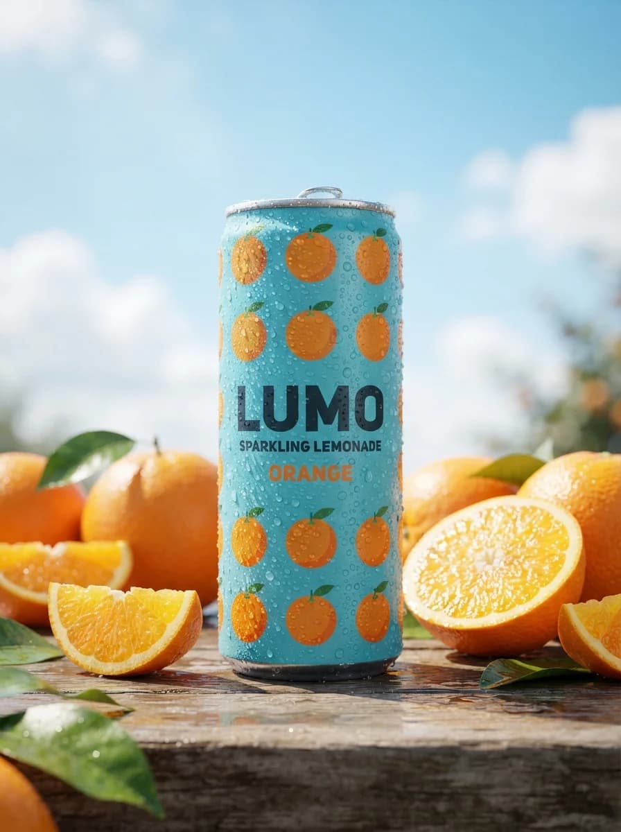
Данный промпт генерирует вертикальный рекламный постер алюминиевой банки газированного напитка в динамичном окружении из всплесков воды и летящих фруктов. Настройка подходит для создания товарных креативов, визуализации упаковки и оформления социальных сетей в летней тропической стилистике. В тексте можно изменять типы фруктов, цветовую палитру фона, а также редактировать текстовые надписи для адаптации под конкретный бренд или вкус. На выходе получается детализированное изображение студийного качества с реалистичной конденсацией, неоновыми бликами и четкой типографикой в высоком разрешении.

Create a vertical 9:16 commercial beverage poster for a fictional summer soda campaign. Use a single aluminum can as the hero object, centered slightly low in frame, front-facing and large enough to dominate the composition. Surround it with a high-energy crown-shaped water splash exploding upward and outward, with suspended droplets, wet reflections on the surface below, and a few floating fruit pieces arranged for depth: citrus slice near upper left, pineapple chunk near upper right, mixed berries and one cut passionfruit near the lower foreground. Keep the can design original and generic: no existing logos, no protected slogans, no copied label artwork, only a bold custom headline area integrated on the can. Typography and copy layout: place the exact campaign text "Summer Soda Energy" as the main readable headline in a clean, bold, high-impact display style, either on the can label or in a dedicated adjacent title zone with strong hierarchy. Add one small secondary flavor descriptor area and one subtle bottom information strip, but keep all extra text generic and minimal. Typography must be crisp, legible, and production-ready, with thick letterforms, controlled spacing, and no imitation of any known brand wordmark. Lighting and materials: build a glossy studio setup with intense backlit liquid sparkle, sharp specular highlights on droplets, visible cold condensation on the can, and a reflective wet tabletop. Use a warm tropical palette led by saturated orange, coral pink, red, and small accents of golden yellow and deep berry tones. Light from upper back and both sides to create bright rim highlights in the splash while preserving readable packaging detail. Keep the product sharp, allow slight motion blur only on a few outer droplets, and render realistic metal, water, fruit flesh, and condensation textures. Composition and finish: emphasize a premium advertising look with strong center focus, layered foreground splash, clean depth separation, and a polished poster finish suitable for a reusable beverage campaign. Background should be a luminous orange-to-pink gradient with subtle glow, not a literal copied set. Reference-image policy: use the provided reference only for general composition logic, splash energy, lighting hierarchy, material treatment, and text placement strategy; do not recreate its exact can design, exact fruit arrangement, exact wording, or brand-specific visual identifiers. Negative constraints: no real brand names, no copied logos, no protected packaging text, no prices, no social handles, no people, no trademarked slogans, no duplicated label art, no low-detail typography, no cluttered layout, no flat lighting, no generic stock mockup look.

Подпишись, чтобы
ничего не пропустить
Бесплатные промпты для нейросетей на русском, новости ИИ и уроки по генерации фото, видео и текста, доступные на всех площадках.