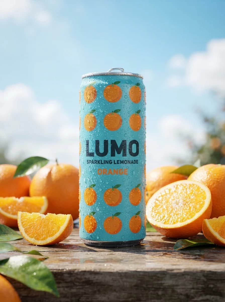
Промпт предназначен для генерации рекламных макетов с использованием концепции детализированной диорамы. Инструмент подходит для создания визуального контента при запуске новых продуктов, оформления товарных карточек и разработки идей для предметной фотосъемки. В тексте можно настраивать центральный объект, менять типы материалов поверхности, виды растений и детали окружающей микро-сцены. Результатом становится детализированное изображение в формате 16:9 с четкой иерархией объектов, реалистичным освещением и свободным местом для размещения рекламного заголовка. Итоговая сцена отличается выраженной текстурностью материалов и эффектом малой глубины резкости, фокусирующей внимание на товаре.
Продукт и брендТоварная съёмка
Create a 16:9 commercial advertising key visual for a new product launch using a debranded diorama concept. Build the scene on a real tabletop or studio platform with rich tactile detail: loose soil, water droplets, dust, small tools, natural imperfections, and a crafted miniature-world finish. Place one hero product or hero package slightly right of center as the dominant subject, scaled up like a landmark object or sculptural installation. Around it, stage a transformation narrative where the printed promise of the product becomes a physical miniature environment emerging from or surrounding the product, with visible progression details from early stage to finished result. Use a clear visual hierarchy: hero product first, transformation detail second, supporting micro props third. Keep the composition readable for advertising and leave clean negative space in the upper left or upper center for headline placement. Lighting: warm directional morning light from the upper right with one defined shaft of sunlight hitting the tallest or most important part of the scene; soft ambient fill from the left; realistic shadows; subtle atmospheric glow; shallow tilt-shift depth of field with the focal plane locked on the hero product and the main transformation area. Materials: weathered paper, printed carton, natural soil, glossy moisture, matte wood, delicate roots, fresh plant surfaces, and crisp product packaging textures. If insects or miniature workers are included, keep them tiny, believable, and supportive, never dominating the frame. Typography and text policy: include only the exact headline text "Launch Campaign" as clean, legible ad typography. Set it in a bold modern sans serif with generous tracking, placed in the reserved negative space, with smaller optional subtext blocks represented as simple geometric placeholders only, not readable copy. Do not generate prices, dates, phone numbers, addresses, certification badges, or extra slogans. Do not place dense text on the product. Any incidental packaging text must be generic, minimal, and non-branded. Color palette: sunlit botanical greens, earthy browns, warm neutrals, muted paper beige, and controlled accent color chosen from the product itself. Keep saturation natural, premium, and commercially polished. Finish as a production-ready campaign image with crisp subject separation, realistic texture, subtle lens bloom, and retouch-quality cleanliness. Reference-image policy: use the reference only as inspiration for composition logic, greenhouse-like warmth, tactile miniature realism, visible growth stages, and the contrast between fragile printed material and life-sized emergence. Do not copy any exact wording, illustrations, layout, packet graphics, logo shapes, or distinctive protected elements from the reference or any upstream source. Negative constraints: no copied brand names, no creator handles, no protected slogans, no exact seed-packet text, no people identities, no messy ad layout, no fantasy exaggeration that breaks realism, no unreadable typography, no extra promotional claims, no duplicate hero products, no clutter that hides the main subject.