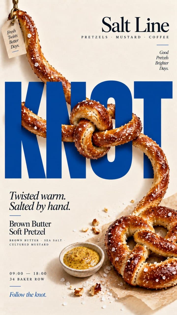
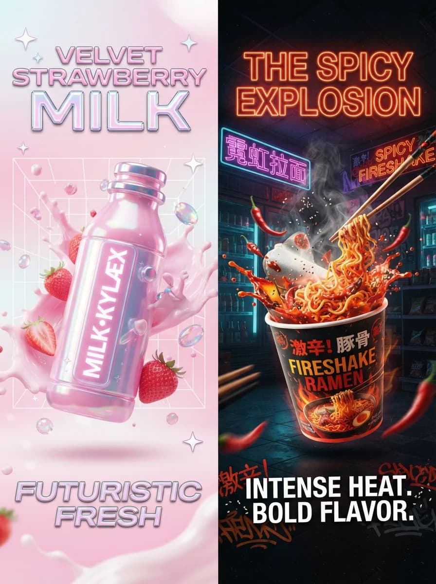
Тревел постер города
Описание промпта
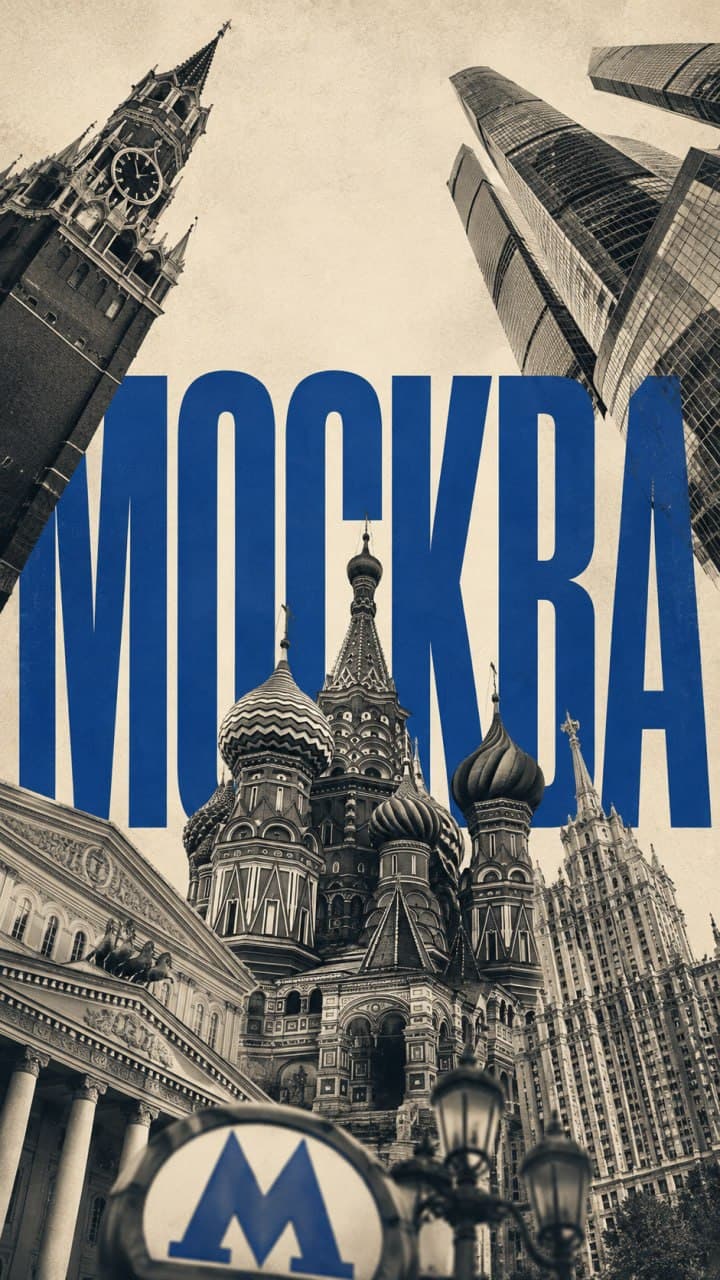
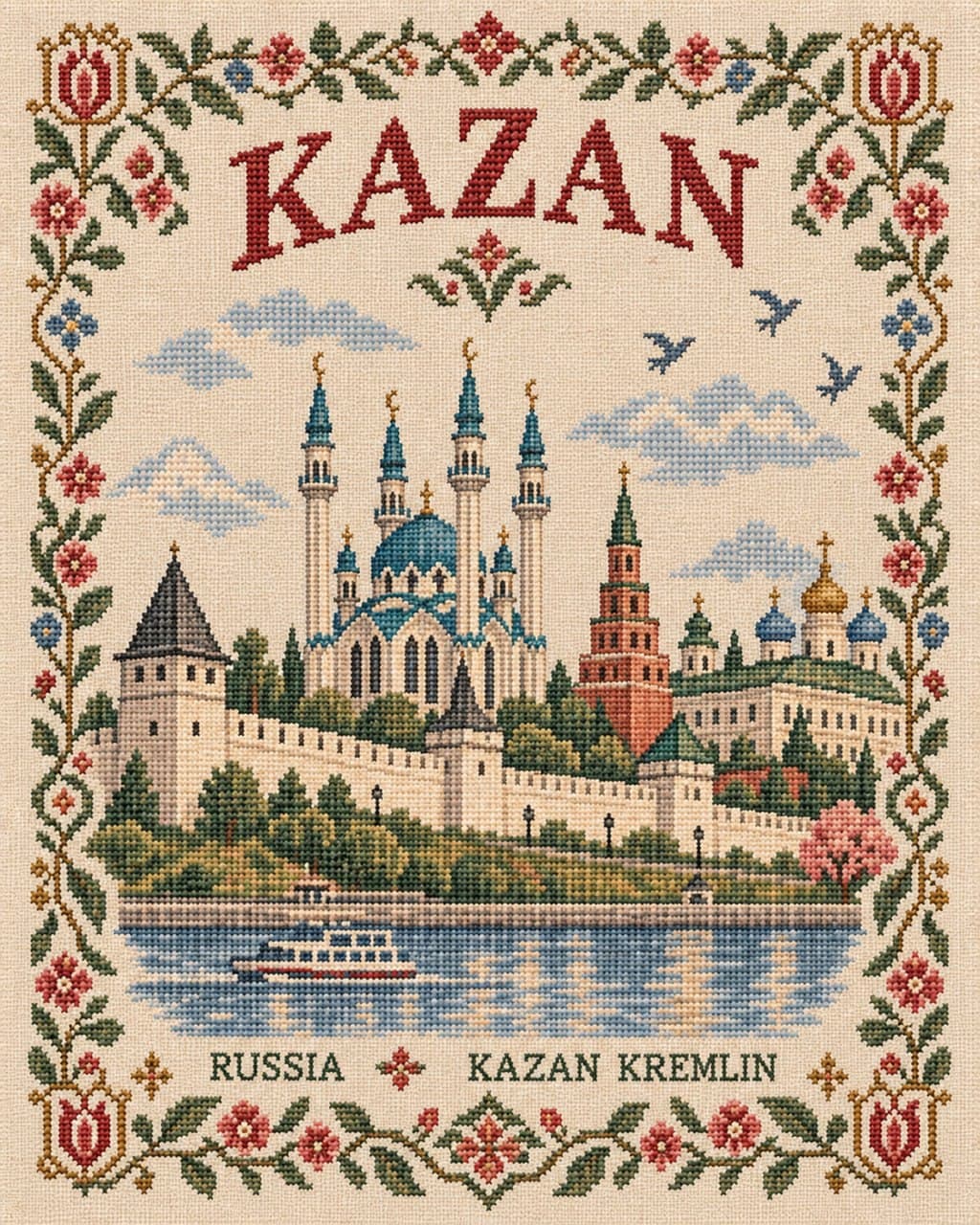
Промпт генерирует вертикальные тревел-постеры городов в журнальной эстетике и стилистике галерейной полиграфии. Шаблон подходит для создания интерьерных принтов, открыток, обложек путеводителей и оформления туристических медиа. В тексте достаточно заменить плейсхолдер [DESTINATION] на название нужного города или региона. В результате формируется минималистичная иллюстрация на белом фоне со строгой геометрической типографикой, узнаваемыми достопримечательностями и текстурой шелкографии в сдержанной палитре.


1 / 4
DESTINATION: [DESTINATION]
Create a premium 3:4 vertical editorial travel poster for [DESTINATION].
STYLE
Contemporary art-book aesthetic with subtle vintage influence — sophisticated, architectural, minimal, and collectible. Think premium gallery print or high-end international travel magazine rather than a conventional tourist poster.
COMPOSITION
Use a pure white background with generous negative space. Place the destination name prominently at the top in bold geometric typography, with the country name beneath it in smaller type. Add one subtle graphic element such as a sun, moon, horizon, or mountain silhouette.
The lower 55–60% should contain one cohesive illustrated scene featuring 1–2 iconic landmarks, one defining natural or geographic feature, and a few authentic local details. Integrate everything naturally into a single believable composition rather than creating a landmark collage.
COLOR
Keep pure white dominant and use only 2–4 sophisticated destination-inspired colors, preferably muted tones with one restrained accent. Avoid excessive saturation, neon colors, dramatic orange sunsets, or overly nostalgic palettes.
ART DIRECTION
Crisp editorial illustration, elegant silhouettes, clean geometry, refined screen-print texture, subtle grain, controlled detail, and strong visual hierarchy. Illustrated and artistic rather than photorealistic.
DETAILS
Include minimal authentic local-language typography and small geographic coordinates where appropriate. Avoid fake architecture, excessive signage, decorative clutter, tourist clichés, gradients, 3D rendering, cartoon styling, and unnecessary text.
FINAL LOOK
A timeless, culturally specific, beautifully restrained destination poster that feels like part of a premium global collection of collectible city and travel prints.



Подпишись, чтобы
ничего не пропустить
Бесплатные промпты для нейросетей на русском, новости ИИ и уроки по генерации фото, видео и текста, доступные на всех площадках.