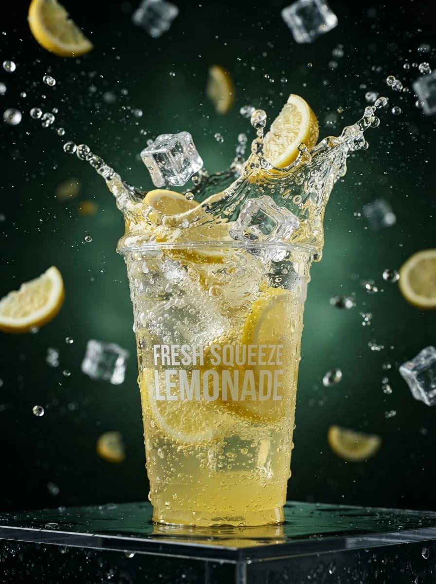
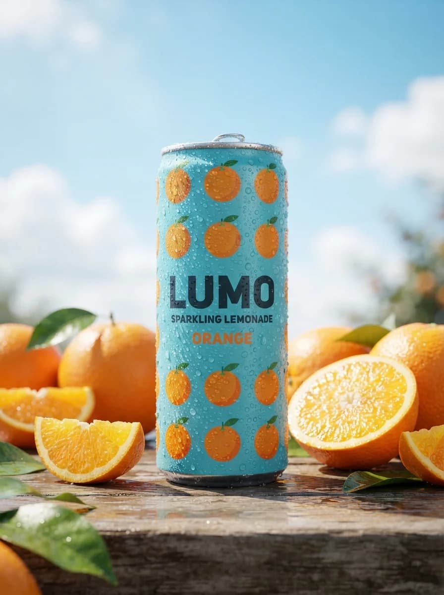
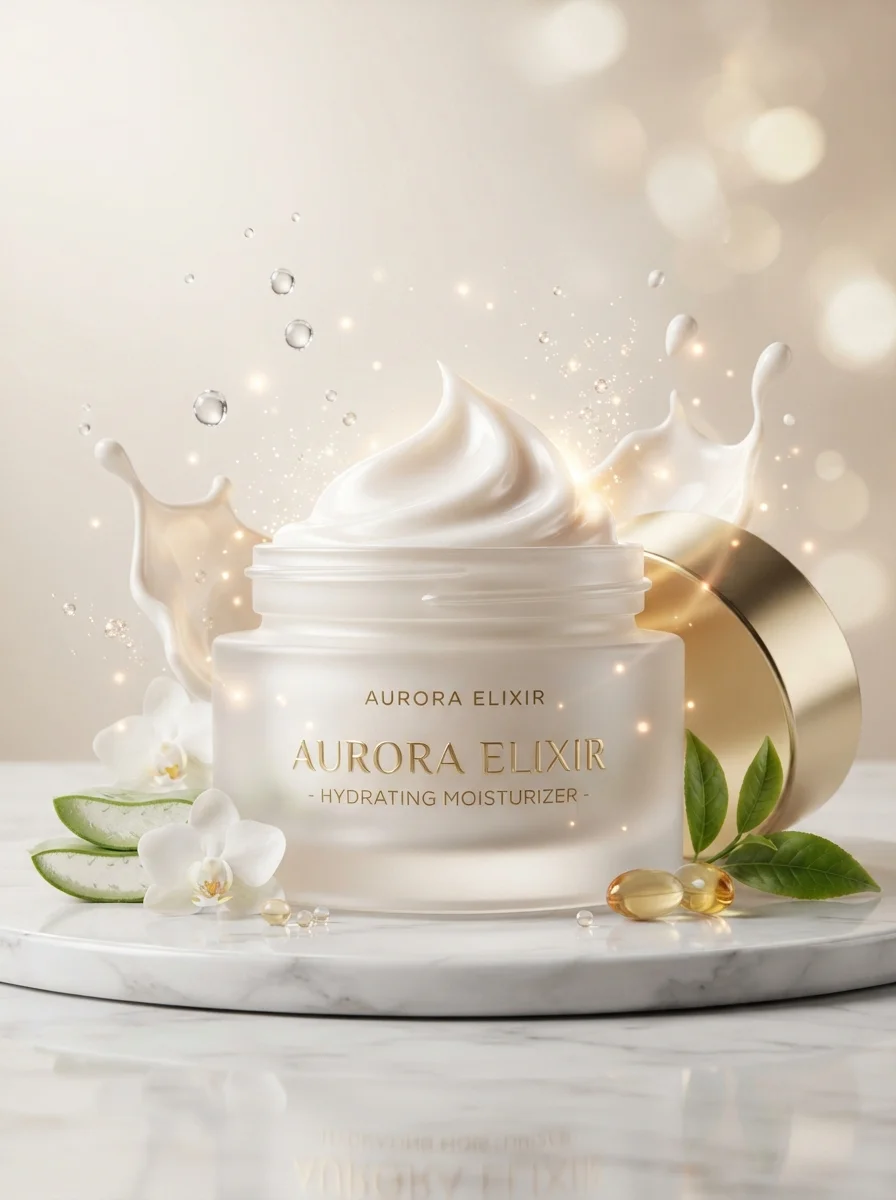
Промпт генерирует вертикальный рекламный постер формата 9:16 для презентации новой линейки холодного кофе. Инструмент подходит для создания визуального контента в социальных сетях, оформления товарных карточек и разработки концепций фуд-фотографии без привязки к конкретному бренду. В тексте можно изменять цветовую гамму акцентных надписей, перечень характеристик в иконках и состав напитка, например, заменить классический латте на холодный чай или лимонад. Результатом становится детализированное изображение с крупным планом стакана, реалистичными каплями конденсата, иерархией типографики и свободным местом для маркетинговых текстов.
Продукт и брендТоварная съёмкаЕда и напитки
Create a 9:16 vertical food-and-beverage advertising poster for an iced coffee launch. Build a debranded commercial composition with one large hero drink dominating the lower-left to center foreground, photographed in sharp perspective so the glass feels close to the camera and visually oversized. Use a transparent tumbler filled with dark espresso, swirling milk, visible clear ice cubes, and fine condensation droplets. Place a second, smaller clean product lineup or alternate serving variation near the lower-right edge to suggest a product family without using any real brand marks. Keep the background as a bright indoor architectural corridor or studio set with soft depth, pale cream and warm beige surfaces, and enough negative space for typography in the upper half. Typography layout: place the required headline "Launch Campaign" large in the upper third, using bold condensed sans-serif uppercase for the main line. Add a secondary hand-painted brush-script accent behind or overlapping part of the headline in a contrasting mint or light aqua tone, but do not use any existing slogan. Reserve a centered row beneath the headline for four simple circular benefit icons with short generic labels such as "Fresh Brew", "Cold Served", "Smooth Blend", and "Crafted Daily". Keep all text clean, legible, and editable, with clear hierarchy: headline first, icon row second, product detail area third, footer metadata last. Footer can include generic placeholders only, no social handles, no prices, no dates, no addresses. Materials and product rendering: glass must be crystal clear with realistic refraction, glossy liquid separation, semi-melted ice edges, soft foam at the top, and natural moisture beads. If packaging is shown, use original fictional label graphics only: abstract coffee bean motif, neutral geometric shapes, and non-branded typography blocks. Avoid logos, trademarks, celebrity likenesses, or copied packaging structure from any known beverage ad. Lighting: use soft commercial studio lighting mixed with directional top-left key light and gentle front fill. Create crisp highlights on ice and glass, smooth gradients in the coffee-to-milk transition, and a controlled soft shadow on the floor below the hero product. Keep exposure clean and premium, with realistic contrast and no blown highlights on label areas. Color palette: warm cream, soft beige, roasted coffee brown, milk white, transparent ice blue-gray, and one fresh accent color such as mint green for headline emphasis. Overall finish should feel polished, appetizing, modern, and suitable for a real campaign mockup. Reference-image policy: use the provided reference only as inspiration for visual hierarchy, oversized foreground product treatment, upper headline placement, icon-row organization, and premium ad finish. Do not replicate any exact logo, slogan, person, bottle shape, label text, social handle, or distinctive brand styling from the reference or upstream case. Output should look like a new original ad concept, not a variation of an existing brand poster.