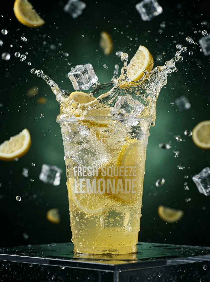
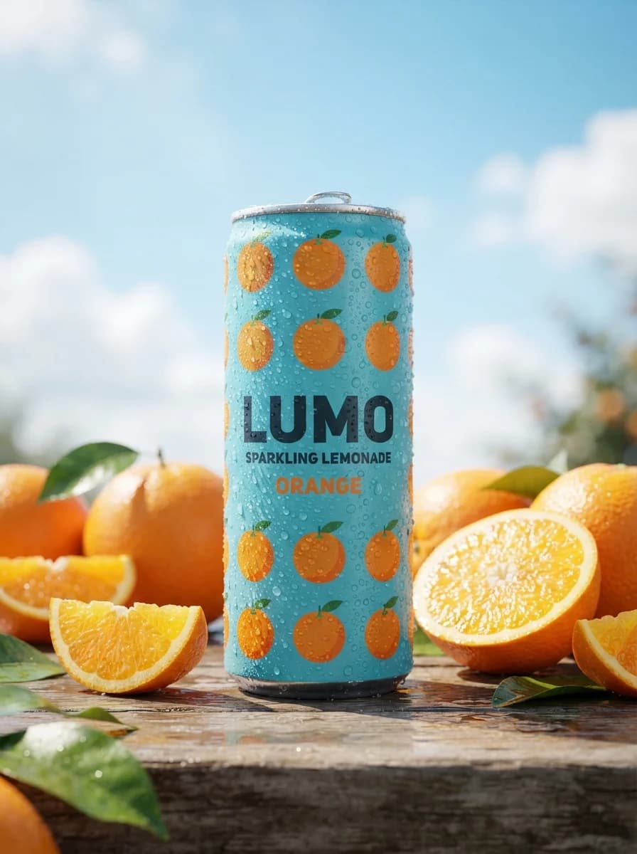
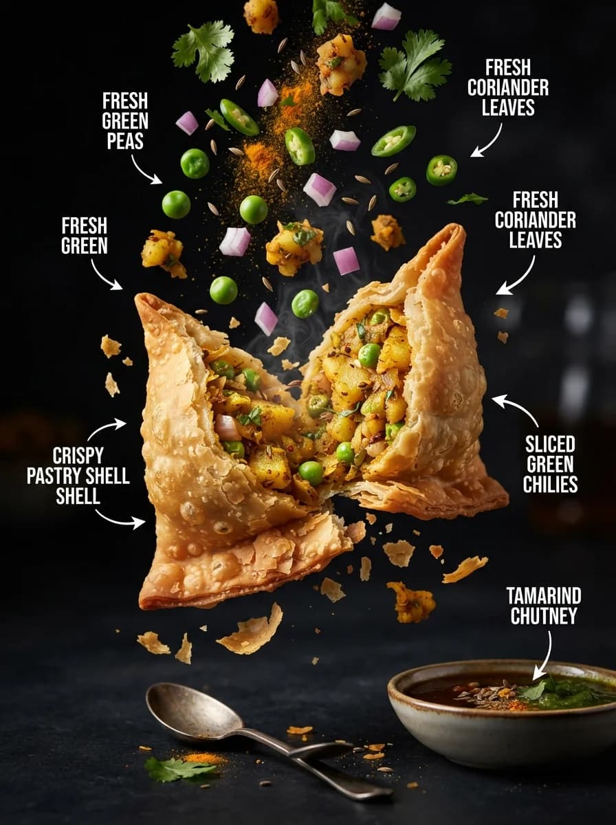
Плакат с рецептами блюд премиум-класса в элегантном оформлении.
Описание промпта
Промпт генерирует вертикальный рекламный постер премиального уровня с акцентом на типографику и фуд-фотографию. Шаблон предназначен для создания коммерческих макетов меню, ресторанных меню-бордов и рекламных кампаний в социальных сетях. Пользователь может адаптировать результат, меняя название заведения, тип основного продукта и текстовые блоки для заголовков или призывов к действию. Итоговое изображение отличается выверенной композицией, мягким естественным освещением и детализированными текстурами продуктов на сдержанном элегантном фоне. Готовый макет сочетает в себе эстетику печатного глянца и чистоту современного минималистичного дизайна.
Дизайн постеровРекламаЕда и напитки
Design a 9:16 vertical premium food-and-beverage promotional poster for a local store, built as a reusable advertising template for [STORE NAME] and [FEATURED PRODUCT]. Use a strong commercial hierarchy: top zone for a small category label and the main headline, center-right or center for a large hero product photographed at a three-quarter angle, mid-lower zone for a short ingredient or feature strip, and bottom zone for a clean step, benefit, or call-to-action panel. The required copy must appear exactly as: "Taste the Moment". Keep all other text generic and editable with placeholders such as [headline], [subheadline], [benefit 1], [benefit 2], [call to action]. Visual direction: elegant premium food poster, not a copy of any existing brand. Show one hero serving with rich texture and appetizing detail, plated or packaged neatly, with a few supporting ingredients arranged in an orderly editorial layout. Use warm natural key light from upper left, soft fill from front, subtle rim light on the product edges, realistic shadows, crisp highlights on glaze, broth, batter, ice, foam, or sauce depending on product type. Materials should feel tactile and believable: ceramic, paper card, brushed metal, lacquered wood, linen, matte cream stock, and subtle food-surface gloss. Background should be warm cream with restrained texture, with optional soft botanical, grain, or paper-fiber detail that does not compete with the product. Typography and layout: refined serif for the main headline, clean sans serif for supporting text, generous spacing, high legibility, clear alignment grid, premium editorial balance. Reserve a visible title block in the upper third, a concise descriptive paragraph block on the left or lower left, a row of small icon or feature markers, and a lower information band divided into neat modules. If using multilingual styling, keep generated text minimal and generic; avoid exact borrowed phrases. Make the poster feel production-ready for print or digital in-store promotion, with clean edges, balanced negative space, and realistic ad-finishing polish. Color palette: warm cream, toasted gold, deep tea green, dark brown, soft black, and natural food tones. Keep saturation controlled except for the hero product, which should be the visual focal point. Emphasize depth, appetite appeal, and premium clarity rather than clutter. Negative constraints: no logos, no watermarks, no social handles, no prices, no phone numbers, no addresses, no invented certifications, no copied slogans, no celebrity likenesses, no copyrighted mascots, no protected packaging text, no dense unreadable text blocks, no distorted utensils, no messy composition, no extra hands unless explicitly needed, no low-resolution artifacts. Reference-image policy: use the unseen reference only as inspiration for structural layout, visual hierarchy, warm lighting, ingredient-strip logic, and premium recipe-poster finish. Do not reproduce exact wording, badge shapes, product arrangement, icon set, or any distinctive brand-identifying details from the source material.