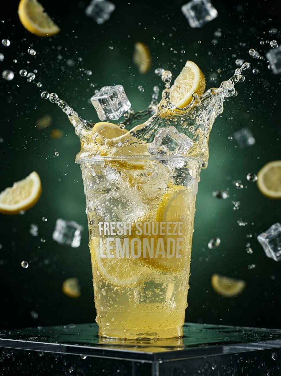
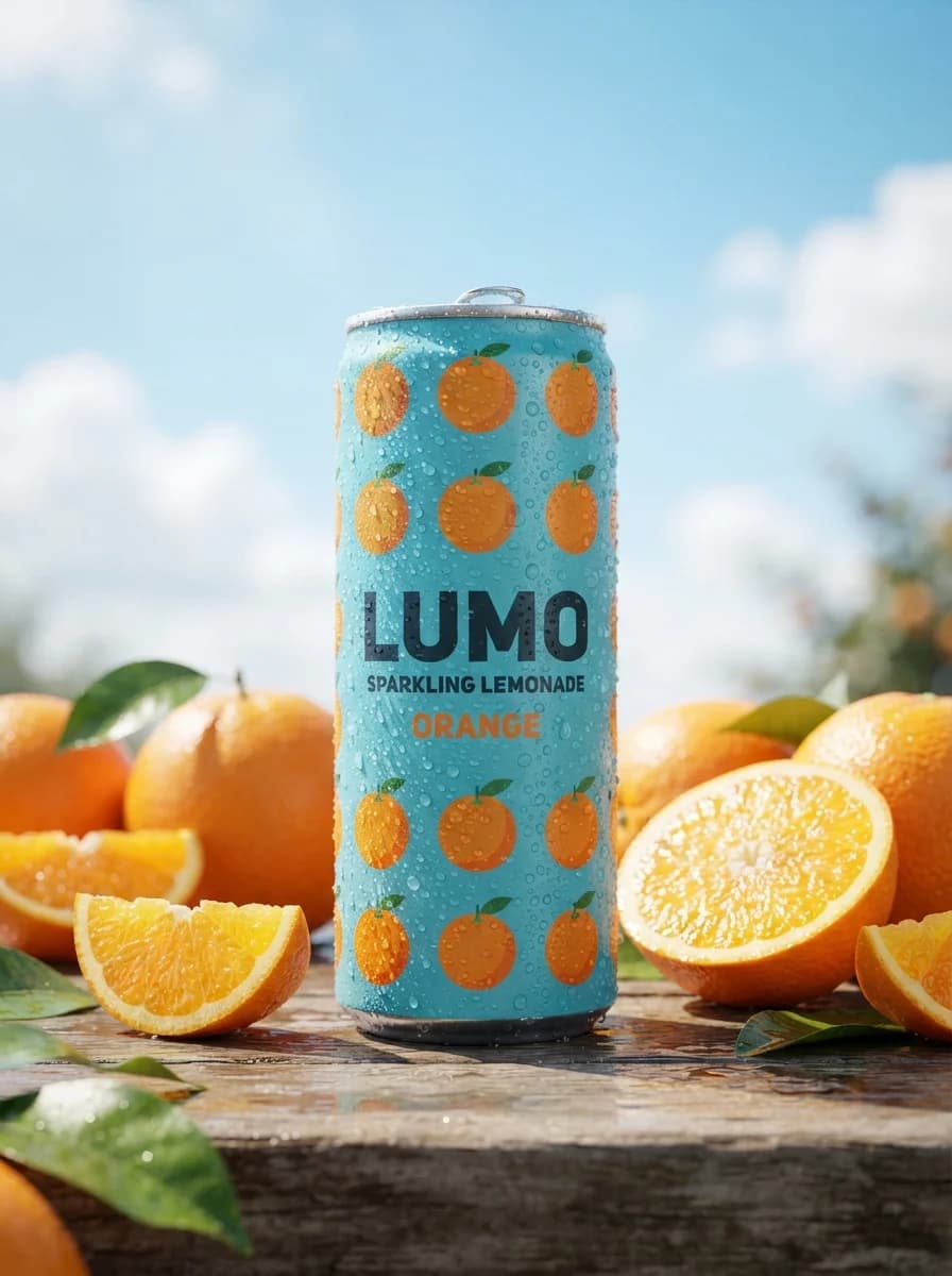
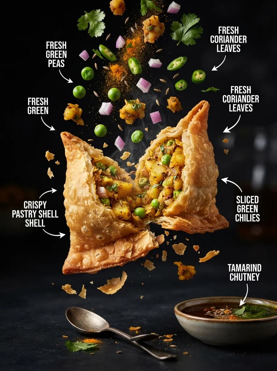
Промпт генерирует вертикальный рекламный плакат премиального холодного чая, выполненный в стиле восточноазиатского минимализма с четкой редакционной версткой. Инструмент подходит для создания макетов наружной рекламы, контента для социальных сетей и визуальных концепций брендов в категории продуктов питания и напитков. В тексте промпта можно изменять состав ингредиентов в стакане, текстуру фона, например, заменить бумагу на шелк, а также корректировать цветовую гамму декоративных элементов и освещение. Результатом становится высокодетализированное изображение с акцентом на материалах, включающее фотореалистичный продукт на фоне графичных природных мотивов с выверенным балансом пустого пространства.
Дизайн постеровРекламаЕда и напитки
Design a production-ready vertical beverage launch poster in 9:16 aspect ratio for a premium cold tea campaign. Use a refined East Asian editorial retail layout with a tall text column on the left, a large headline block in the upper left, a product hero on the right-center, and a small modular information area near the lower left. Keep 20 to 25 percent negative space so the layout feels calm and upscale. Main subject: a transparent takeaway cup filled with pale golden iced tea, visible tea leaves suspended in the liquid, clear ice cubes, realistic condensation, and sliced citrus fruit inside the cup. Place the cup slightly right of center, large and dominant, standing on dark stone with a few loose tea leaves and fruit slices in the foreground. Add a subtle circular seal mark on the cup using generic geometric line art only, with no real logo. Background and scene: textured warm ivory paper backdrop with soft ink-wash mountains fading into mist, a muted golden sun disk near the upper right, and deep forest-green framing shapes along the left edge and lower right edge. Materials should feel tactile and premium: fibrous paper grain, mineral stone, glossy ice, translucent liquid, fresh citrus flesh, and matte botanical leaves. Do not make the scene busy; all decorative elements must support the product. Lighting: soft warm key light from upper left, gentle rim light on the cup edges, controlled specular highlights on the ice and lid, atmospheric haze in the mountain area, high micro-contrast on the beverage, no harsh flash, no blown highlights, no muddy shadows. Typography and copy layout: use elegant Chinese-inspired editorial typography placement but render clean commercially usable text. The primary headline must read exactly "Spring Tea". Place it in the upper left as the largest text element. Add smaller supporting text blocks below and around it as generic placeholder campaign copy only, using short debranded phrases such as product series, launch note, feature callouts, and event badge. Use clear hierarchy: headline, secondary label, launch statement, feature badge, small footer strip. Thin divider lines, framed label boxes, and neat vertical spacing are encouraged. Do not include prices, phone numbers, addresses, QR codes, social handles, dates, or proprietary slogans unless provided later by the customer. Color palette: deep forest green, warm ivory, muted gold, tea yellow, stone gray, and natural citrus pink-yellow accents. Keep saturation restrained and premium. The poster should feel modern, elegant, seasonal, and commercially finished. Reference-image policy: use the reference only as inspiration for composition hierarchy, product-to-text balance, material contrast, and premium tea-ad structure. Do not reproduce any exact brand name, logo, emblem, price block, QR code, signature text, or distinctive graphic arrangement from the reference. Generate an original debranded campaign visual suitable as a reusable gallery case. Negative constraints: no copied branding, no celebrity likeness, no exact protected text, no cluttered typography, no fake discounts, no invented store info, no low-end poster effects, no distorted cup anatomy, no unreadable text, no extra products competing with the hero cup.