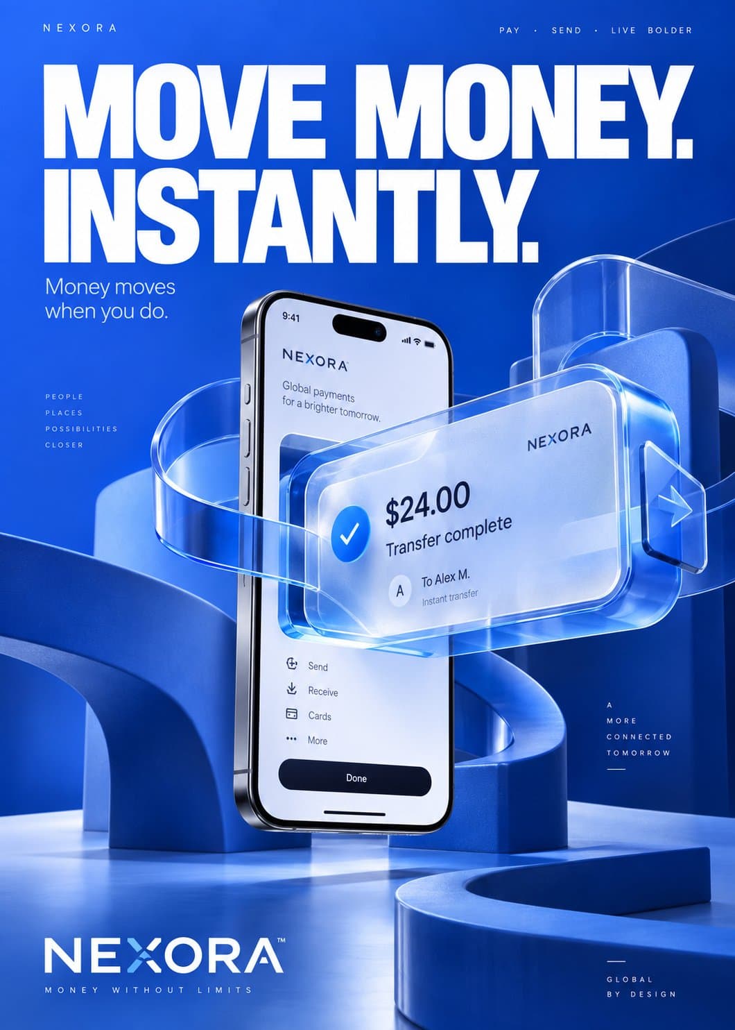
Create a commercially usable 9:16 vertical advertising gallery case image for the advertising industry. Build a dark, premium campaign-presentation layout with a strong hero panel at the top and three to four supporting content bands below it, using the reference only as structural inspiration for hierarchy and atmosphere, not as content to replicate. The image should feel like a polished marketing case-study poster that can be adapted to a new product or campaign. Composition: top section occupies about 35% of the canvas and contains the main focal area, with a large headline zone on the left and a cinematic media-style visual on the right. Below that, stack modular content sections with rounded rectangular panels, consistent gutters, and a clean grid. Include one timeline-style strategy section, one performance-data section with metric cards and a growth chart, one three-card benefits section, and one bottom call-to-action strip. Keep spacing disciplined, with clear separation between panels and a strong reading flow from top to bottom. Subject and imagery: use a generic campaign-tech visual language, such as abstract screens, interface reflections, glowing charts, light trails, and a debranded media-control symbol. If a human silhouette is included, keep it anonymous, back-facing or side-facing, without identifiable features. No logos, no brand marks, no social handles, no known platform icons, no real company names. The visual emphasis is on launch energy, momentum, analytics, and campaign execution. Typography and text policy: show one clear headline area and multiple smaller information zones, but keep all text minimal and generic. The only exact visible copy allowed is "Launch Campaign". All other text should appear as short neutral placeholders, abstract UI labels, or unreadable microtext blocks. Use a modern geometric sans-serif look, bold for headline zones, medium weight for subheads, compact small caps for labels, and high legibility with strong contrast. Materials and surface treatment: use dark glass panels, soft translucency, subtle bloom, fine edge highlights, polished UI cards, faint noise texture, and metallic-violet accent reflections. Rounded corners should be consistent across cards. Charts and badges should feel embedded in the interface, with layered depth and restrained glassmorphism rather than exaggerated blur. Lighting and color: low-key studio lighting with a deep navy to near-black background, accented by electric violet, indigo, and cool blue highlights. Add controlled neon glow around key UI elements, a soft rim light on the hero visual, and gentle volumetric haze for depth. Maintain premium contrast and clean highlight rolloff; avoid flat black emptiness. Commercial finish: make the final image look production-ready, with crisp edges, clean alignment, realistic UI depth, premium ad-poster polish, and balanced information density. The composition should support reuse for a different campaign, product, or service without depending on any specific upstream identity. Negative constraints: do not copy any exact brand name, creator name, logo, slogan, testimonial, company list, price, date, person identity, social handle, or protected text from the source material. Do not recreate the original layout verbatim. Do not use recognizable platform branding. Do not generate extra claims, certifications, phone numbers, addresses, discounts, or fabricated statistics that look factual. Reference-image policy: the provided reference is style inspiration only for composition, lighting, panel rhythm, and color hierarchy. Do not treat it as an image-to-image source; reinterpret it into a new, debranded, original campaign case visual.