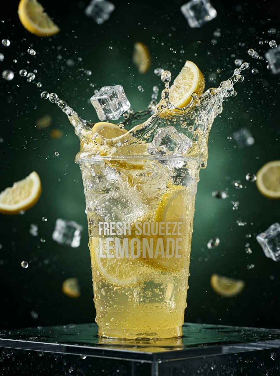
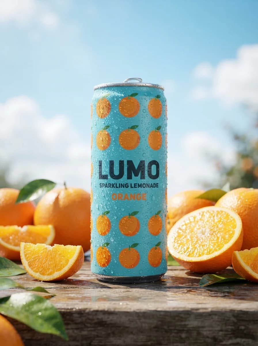
Профессиональная предметная фотосъемка холодной газированной воды.
Описание промпта
Этот промпт генерирует рекламное изображение газированного напитка в алюминиевой банке, установленной в золотистый пляжный песок на фоне тропического заката. Шаблон идеально подходит для создания контента для социальных сетей, каталогов продукции и рекламных кампаний прохладительных напитков в летней стилистике. В тексте можно адаптировать дизайн упаковки, изменить вид фруктов для декорации или настроить цветовую гамму неба и освещения под конкретный брендбук. Результатом становится детализированная визуализация с реалистичными каплями конденсата, мягким размытием заднего плана и профессионально выстроенным студийным светом, подчеркивающим текстуру металла и песка.
Продукт и брендТоварная съёмка
Create a square 1:1 commercial product advertising image for a new sparkling water campaign. Show one tall, slim beverage can standing upright in fine golden beach sand at the center, with a slight natural lean and a small sand mound at the base. The can must be fully debranded: use a generic tropical fruit illustration, abstract geometric label shapes, and clean placeholder packaging design with no real brand marks, no protected slogans, and no copied logo structures. Add realistic cold condensation droplets across the aluminum surface, crisp metallic highlights on the rim, and subtle moisture texture to emphasize refreshment. Build the composition with a strong vertical hero product, shallow depth of field, and a bright tropical background. Use a warm sunset-orange to yellow sky gradient, soft blurred clouds, a distant low horizon, and a lightly blurred shoreline band near the lower background. Place one fresh citrus wedge in the front-right foreground and a few small tropical leaves or grasses near the can base for scale and framing. Keep the can in sharp focus and the background softly blurred. Lighting must feel like high-end studio advertising blended with outdoor summer atmosphere: frontal key light for label clarity, a warm backlight for rim separation, soft fill from camera left, and clean contact shadows in the sand. Materials must read as realistic aluminum, wet condensation, juicy fruit flesh, fine sand grains, and soft atmospheric haze. Avoid plastic-looking textures, oversharpening, or artificial glow. Typography layout: reserve a clear headline zone in the upper-left or upper-center sky area and place the exact text "Launch Campaign" there in bold, clean sans-serif lettering. Keep the typography minimal, large, and highly legible with strong contrast against the sky. Do not add price, dates, social handles, certification marks, ingredient claims, or extra marketing copy. Leave enough negative space so the layout can function as a reusable campaign poster. Color palette: dominant warm orange, sunlit yellow, aqua-teal, fresh citrus green, and neutral metallic silver. Overall finish: polished advertising photography, production-ready, commercially usable, realistic lens rendering, controlled reflections, natural perspective, and premium retouching. Reference-image policy: use the provided reference only as off-image inspiration for composition, refreshment cues, tropical mood, color blocking, and commercial finish; do not reproduce any exact branding, label text, logo arrangement, or distinctive protected package design from the reference or source case. Negative constraints: no real brand names, no copied package graphics, no exact logo shapes, no celebrity likenesses, no extra cans, no distorted proportions, no fantasy liquids, no unreadable headline, no fake labels, no watermark, no random text blocks.