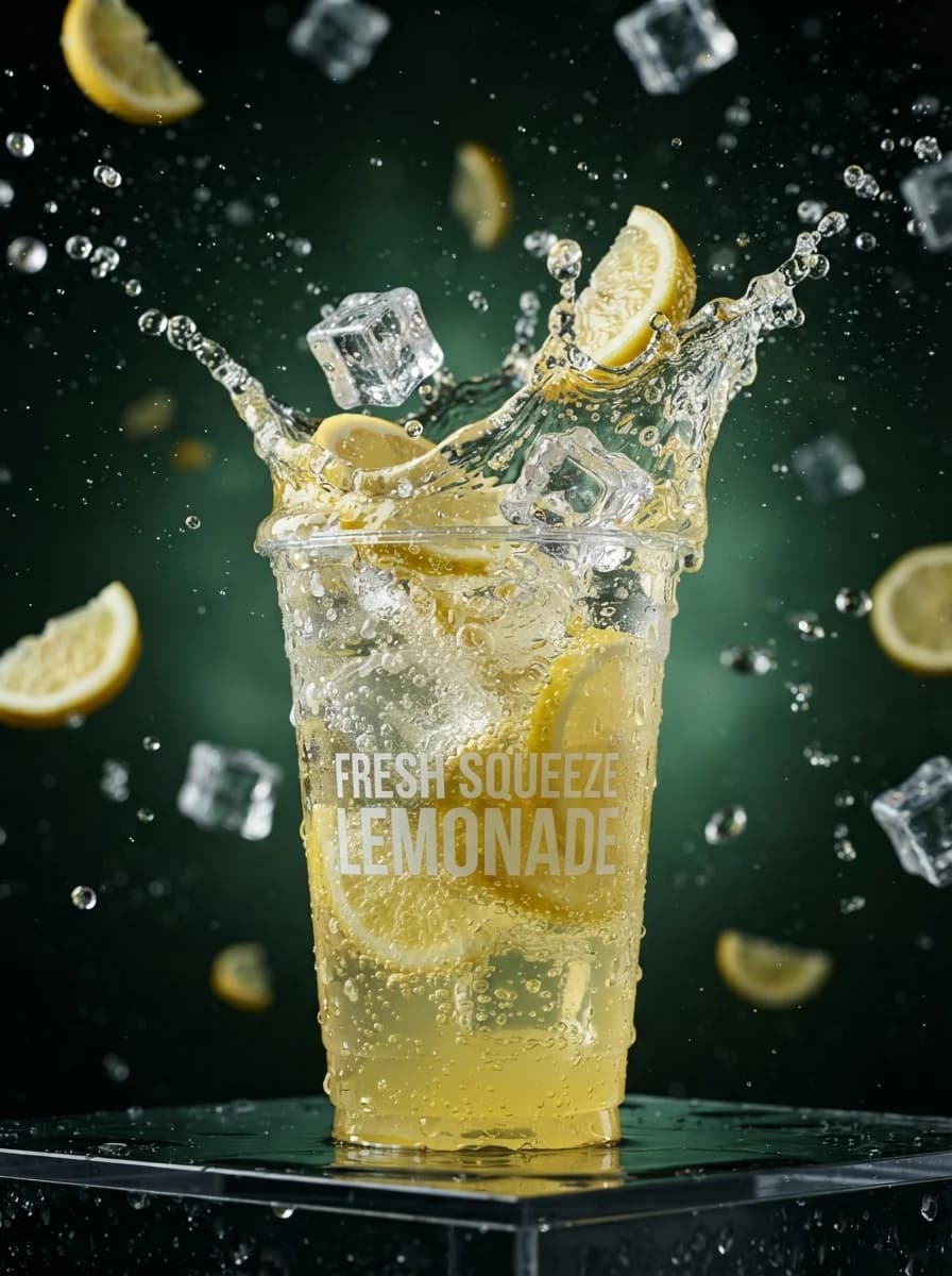
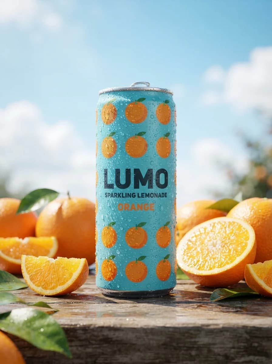
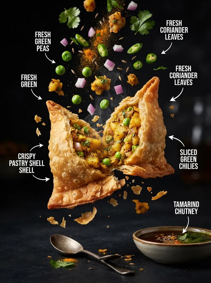
Этот промпт генерирует рекламный триптих для линейки премиального темного шоколада, состоящий из трех тематических панелей в одном кадре. Инструмент предназначен для создания концептов визуальной рекламы, дизайна упаковки и контента для социальных сетей в сегменте фуд-фотографии. В тексте можно изменять вкусовые акценты, виды добавок, материалы упаковки, а также цвета металлического тиснения и тип шрифтов. Итоговое изображение представляет собой профессиональный рекламный постер с высокой детализацией текстур, кинематографичным освещением и малым значением глубины резкости. Проработанная композиция с акцентом на центральный объект позволяет получить готовый референс для коммерческой съемки или портфолио дизайнера.
Дизайн постеровРекламаЕда и напитки
Create a square 1:1 premium food-and-beverage product advertisement for a fictional dark chocolate collection. Build the layout as a polished gallery case with three coordinated flavor variants shown as a triptych in one frame: left panel warm citrus mood, center panel nut-and-sea-salt mood, right panel berry mood. In each panel, place one chocolate bar package as the hero object, standing upright and slightly tilted forward, with the top of the wrapper opened to reveal segmented chocolate pieces. Keep the product dominant and centered within each panel, with supporting ingredients arranged around the base and background to reinforce flavor cues without clutter. Use a luxury packaging system: matte black paper wrapper, subtle metallic foil accents in soft gold, embossed crest-like monogram that is original and non-branded, refined serif typography, realistic printed label hierarchy, crisp edges, premium carton structure, and highly believable chocolate texture. Show flavor distinction through environment and garnish only: dried citrus slices and dark cocoa fragments on the left, pistachios and coarse sea salt in the center, raspberries and glossy chocolate sauce on the right. Maintain shallow depth of field, sharp focus on the package front and chocolate surface, and gentle falloff into the background. Lighting must be cinematic and product-photography precise: controlled studio setup, strong key light from upper left, narrow rim light to define package edges, soft fill to preserve label legibility, localized specular highlights on foil and chocolate, subtle reflections on a dark or stone-textured surface, and rich shadow depth without losing detail. Color palette should be deep black, warm amber, muted pistachio green, and dark raspberry red, with each panel carrying its own tonal atmosphere while still feeling like one campaign system. Typography placement: reserve clean text zones in the lower third of each panel. Add one primary campaign line exactly as: "Taste the Moment". Support it with short generic descriptive copy in smaller elegant serif or clean small caps, but do not include prices, dates, social handles, or brand-specific claims. Keep text readable, evenly spaced, and integrated into the poster composition with high contrast against the background. The final result should look commercially finished, suitable for a luxury launch poster, social ad, or packaging campaign case study. Reference-image policy: use the unseen reference only as inspiration for composition rhythm, premium product staging, dark editorial mood, and multi-variant campaign structure. Do not reproduce any existing logo, brand name, exact flavor names, proprietary wording, or distinctive package graphics. Avoid copied slogans, copied icon marks, watermarks, celebrity likenesses, retail pricing, or protected text. Output as a clean, original, production-ready advertising visual.