Стильные постеры для еды
Описание промпта
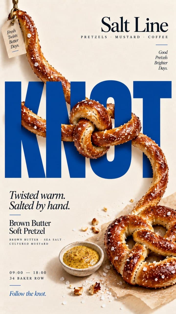
Генерация коммерческих рекламных постеров с едой и напитками на основе текстовых параметров бренда, продукта и композиции. Промпт подходит для создания графики в меню, каталогов доставки, баннеров для социальных сетей и рекламных макетов ресторанов. В структуре шаблона настраиваются название марки, главный продукт, рекламный заголовок, фоновый цвет, палитра акцентов и направление компоновки. На выходе получается детализированное изображение фуд-дизайна с реалистичными текстурами, крупной редакционной типографикой и выверенной геометрией кадра.
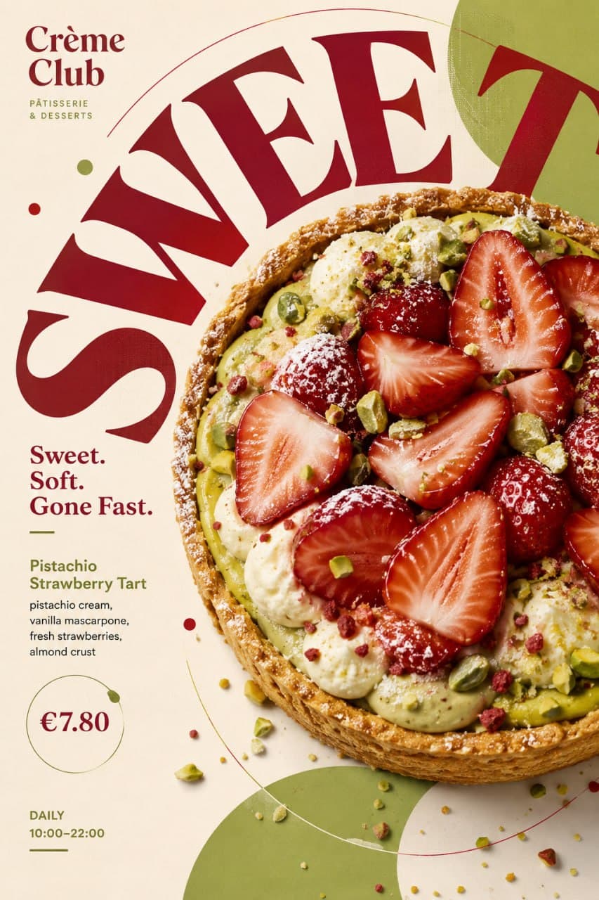
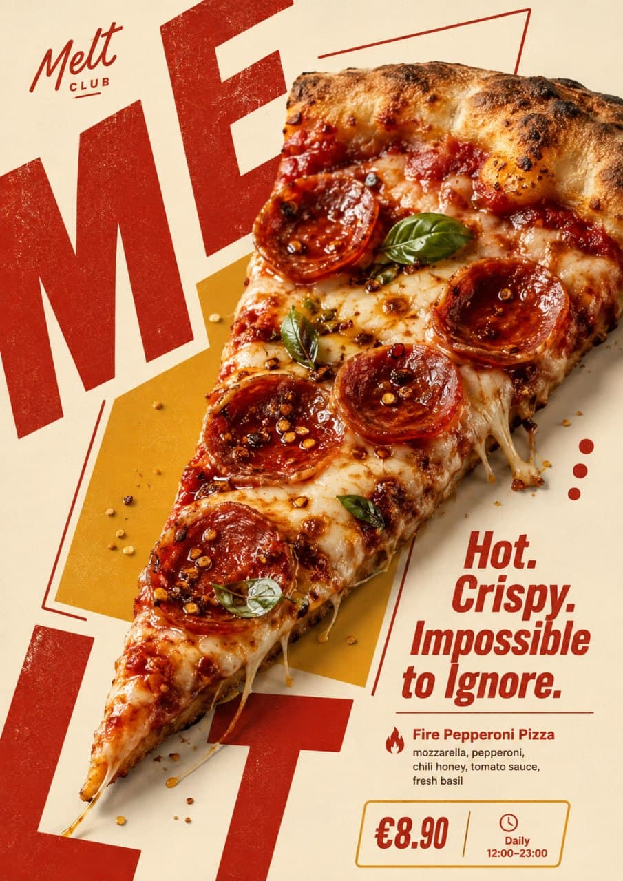
1 / 4
Brand: {brand name}
Food / Drink: {main product}
Headline: {main campaign line}
Supporting text: {product name / ingredients / price / opening hours}
Background color: {light neutral or soft brand color}
Accent colors: {1–2 restrained accent colors}
Typography word: {one short word related to the product}
Composition direction: {vertical / diagonal / circular / crossed / horizontal}
Build the entire poster around the natural shape and direction of the food itself.
Use one clear hero product with highly realistic food photography: appetizing textures, natural highlights, shadows, moisture, crumbs, glaze, melted cheese, glass reflections, fresh ingredients, or other details appropriate to the product. Avoid CGI, plastic textures, excessive retouching, or generic e-commerce photography.
Let the product shape determine how the layout moves. A tall drink can drive a vertical composition, a pizza slice can create a strong diagonal, a round bowl can guide circular typography, and crossed products can form an X-shaped structure.
Use oversized editorial typography as an active part of the composition. The main word should be very large, cropped by the canvas, partially hidden behind the food, split across different areas, rotated, curved, or extended beyond the frame according to the product geometry.
The food and typography must overlap and interact. Do not simply place text beside the product. Let the product cover parts of letters, cross typographic boundaries, break through color blocks, or interrupt the grid so photography and graphic design feel integrated.
Use a clear hierarchy:
oversized display typography,
hero food photography,
main headline,
product information,
price / time / short supporting details.
Keep all supporting copy meaningful and concise. Do not use Lorem Ipsum or random filler text.
Use a restrained color system with a light background, realistic food colors, and 1–2 brand accents. Add only a few graphic elements such as thin lines, dots, open frames, geometric blocks, soft organic shapes, or small information labels.
The composition should feel energetic and asymmetric while still carefully art-directed, with enough negative space to keep the poster readable.
Final style: modern food editorial design, bold typography, dynamic composition, photorealistic food photography, retro-modern branding, clean spacing, playful but professional.



Подпишись, чтобы
ничего не пропустить
Бесплатные промпты для нейросетей на русском, новости ИИ и уроки по генерации фото, видео и текста, доступные на всех площадках.